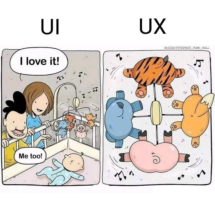
A UX designer is someone who can decide how a website is navigated and their goal is to make he navigation and use of the site as easy and pleasant as possible.In order to achieve this, the UX designer applies some techniques as moderated research, usability testing, user interviews,surveys,card sorting, tree testing etc.
What happens when a UX designer has to create or redesign a digital product for kids?UX design for kids is a completely different field as the whole communication framework with those ages. Speaking as a mother of a 2-year old girl which has already developed a quite good relationship with touchscreens I have come in some early conclusions by observing her.How kids think? In order to create a product with a “kid approach” and improve efficiently their experience the first step is quite easy. Forget everything we already know. Different persona, different approach.Observing a kid interacting with their favorite app or website we notice the following:
Button means interaction.A kid may not be interested to continue in a different interaction but may just tap a button from curiosity to see what happens next.
Kids use their memory.They will memorize that emoticon of the music note because they will remember last time the tapped it and a lullaby started playing. They will tap again and again expecting the same interaction.Knowing that, they will try every possible button examining the function of the components.
Now days, kids spend time in a computer 3 times more than the past decade. I remember myself having my first computer when I was 9. There weren’t any smartphones or tablets and the laptops were not exactly portable back in the days! Unlike the present time, kids become user before they start to communicate with speech , and also before they gain the ability to remember , or read. Most of the product that address in very young ages, consist of vibrant colors,big buttons and pleasant simple melodies.Ιn those ages pop-up adds cause a very unpleasant and frustrating experience for kids.
In a little bigger ages, kids start to recognize a word as a picture even if it is not able to read yet. This can allow it use simple buttons and interact in navigation, or even interact with simple gaming apps.Components must be easy to recognize and they must have easy and common key words(for ex.:start game, retry, exit etc.)and never more than 3–5 words.
Growing up more, when a kid reaches the age of 8–10 is now an experienced user at least in touchscreens, capable of scrolling , swiping up commenting liking and subscribing.Kids now with those new abilities they gained are demanding users thirsty for more and more features.Kids’ evolution force us to adapt by redesigning signature apps and websites for the best possible experience for them.
Colors: Becoming users in such young ages as previously said they haven’t yet gained the ability of communication color is the most powerful key for interaction.Younger kids get attracted by vibrant primary colors because their eyesight hasn’t fully developed yet.Growing up, it is observed that kids tent to choose more relaxing and smooth colors.
Text:Simple key words,using the well known memory trick of the 3. Using 1, 3 or 5 key words easy to remember.
Tap — tap: or Gestures.Almost every kid is only familiar with scrolling and taping interactions.
Tiny hands: One more thing,those tiny hands and fingers!Kids many times struggle holding a smartphone with one hand and without realizing they have two or more fingers tapping on the screen at the same time. The result is no action at all.It is very important for kids to interact in multi-touch screens.
Spacing:At this time we have to point out that proper spacing and clean lines is an equally important issue. We have to mind the accessibility because young kids haven’t yet developed their motor skills.
Sound:Sound is another powerfull irritant which can be used to a kid to gain its attention, interact and also make it learn via sounds.
Ux design for kids is not an easy task, but it is our obligation to take care of the new generations respect their wishes and needs with love,empathy and full support, delivering to them the most pleasant User Experience possible.
Thank you for reading.
 © 2025 All Rights Reserved.